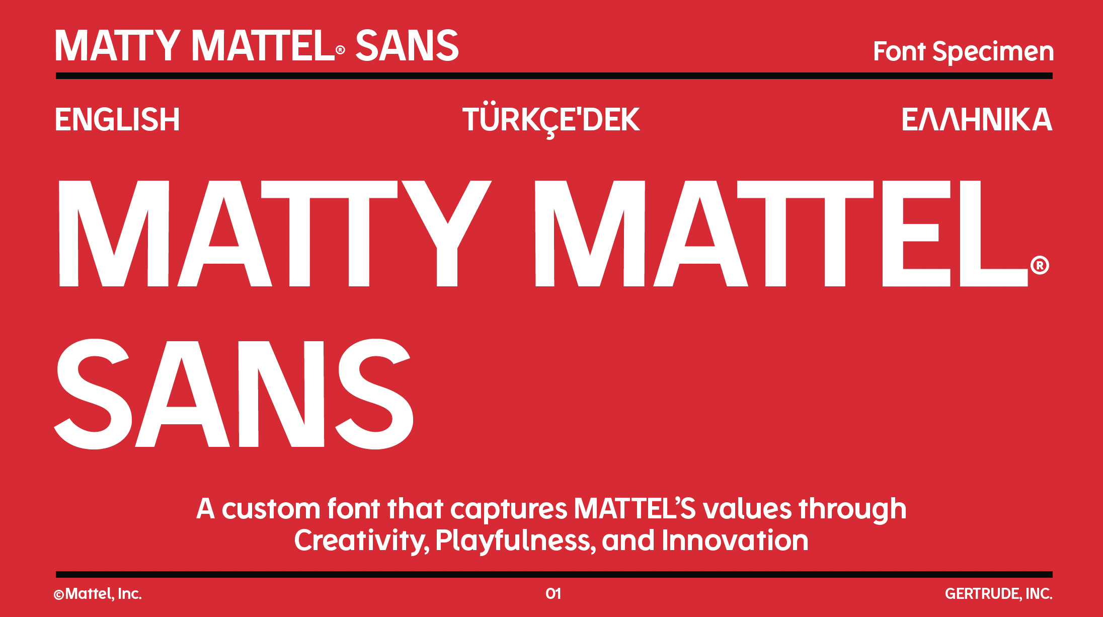
I was tasked with creating not only a new tagline for Mattel but also a new typeface. I brought in Gertrude to tap into their foundry to create a unique, scalable, and ownable typeface.
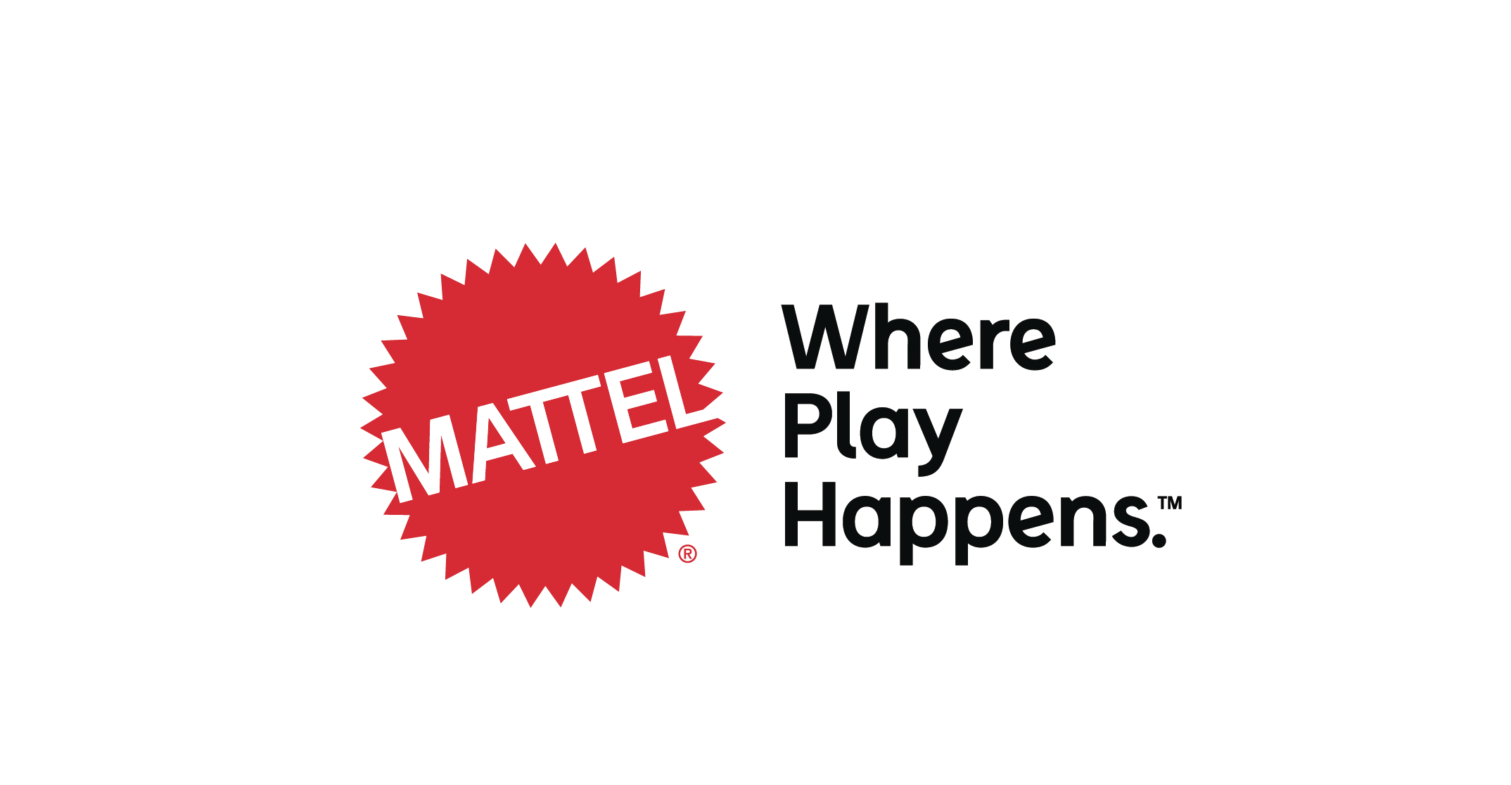
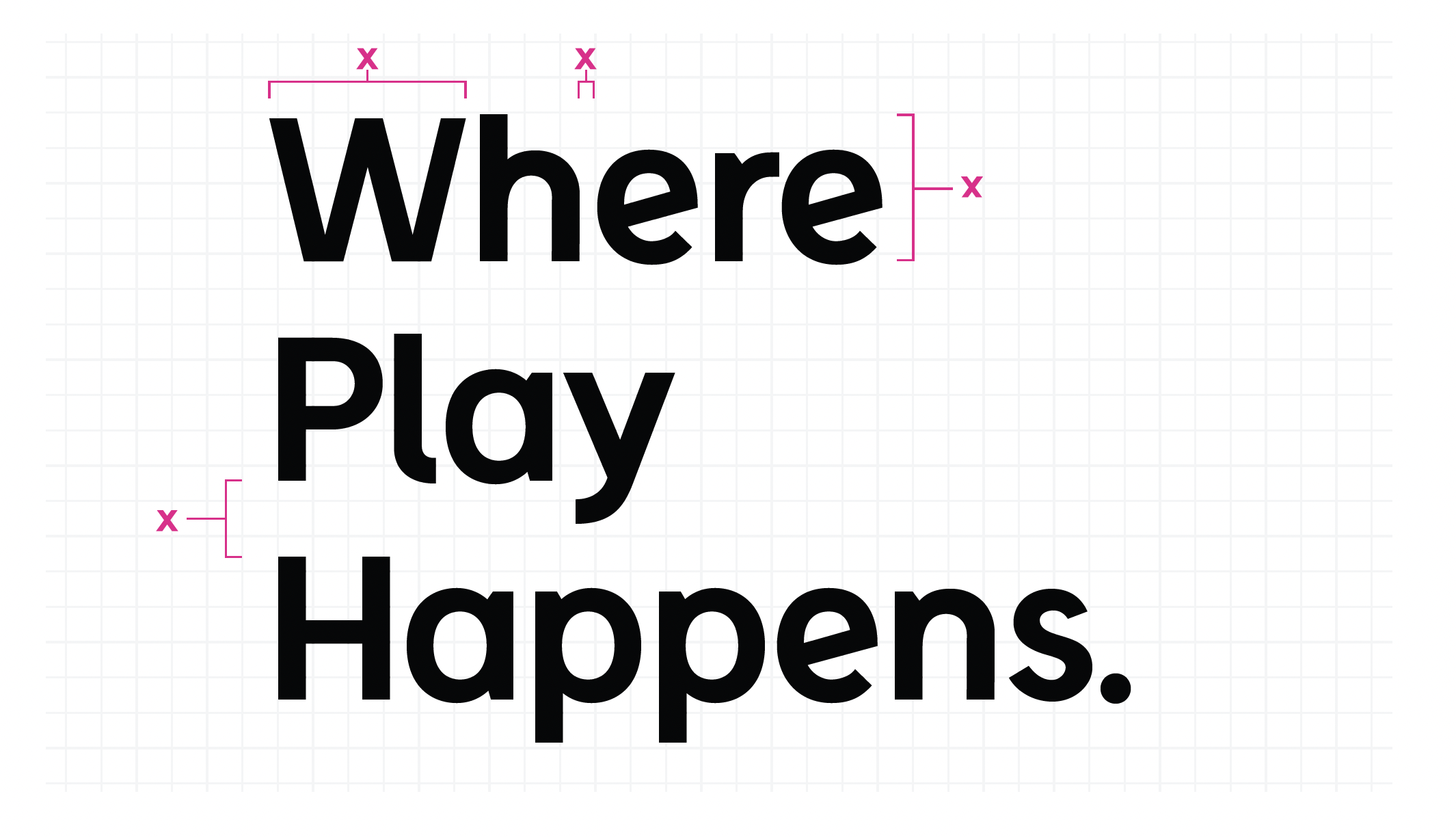
I wrote: “Where Play Happens” as the new direction for Mattel and tasked Gertrude with bringing to life the playfulness of the brand in a system that could be exported globally for Mattel as an internal and external typeface.
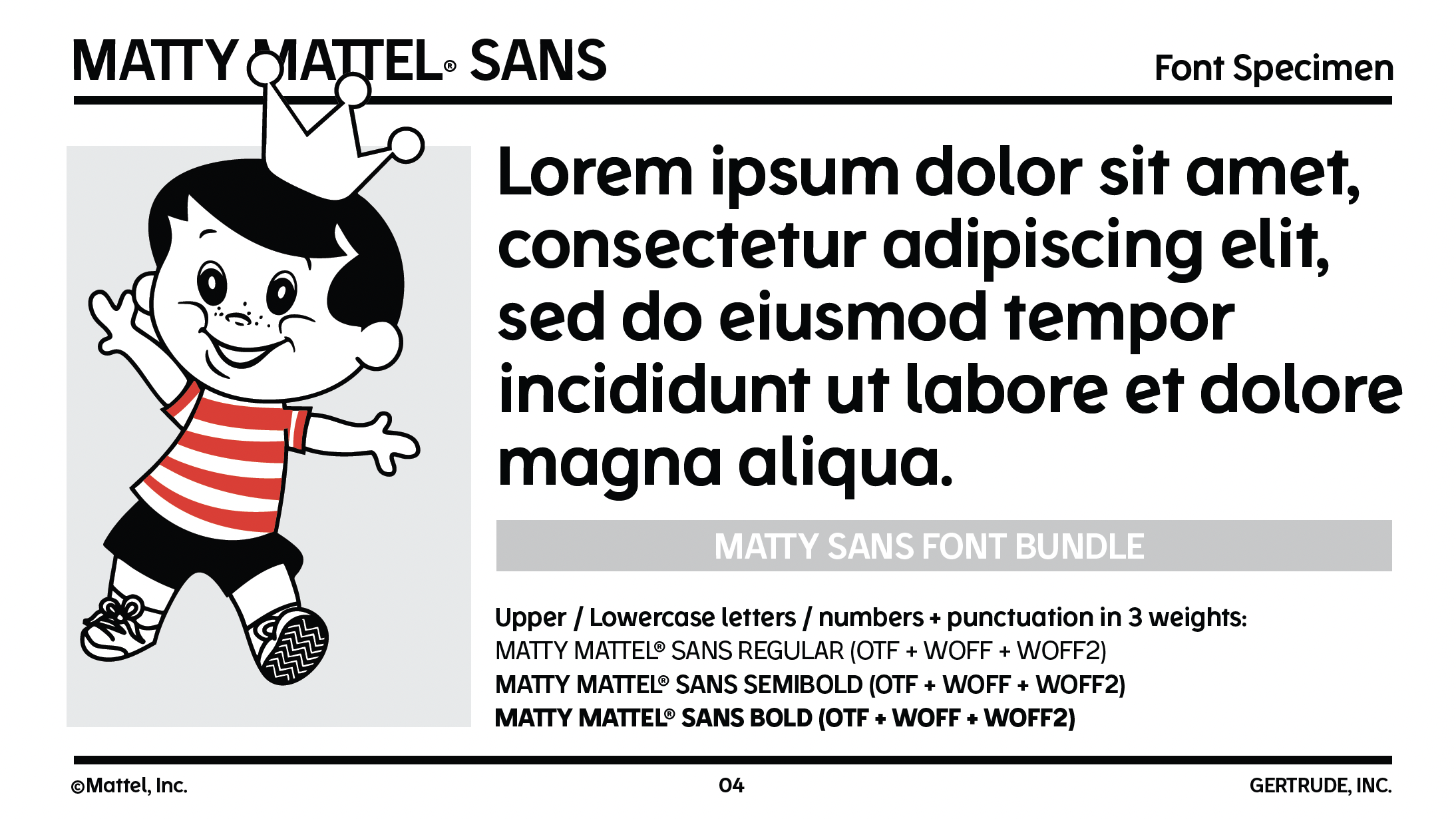
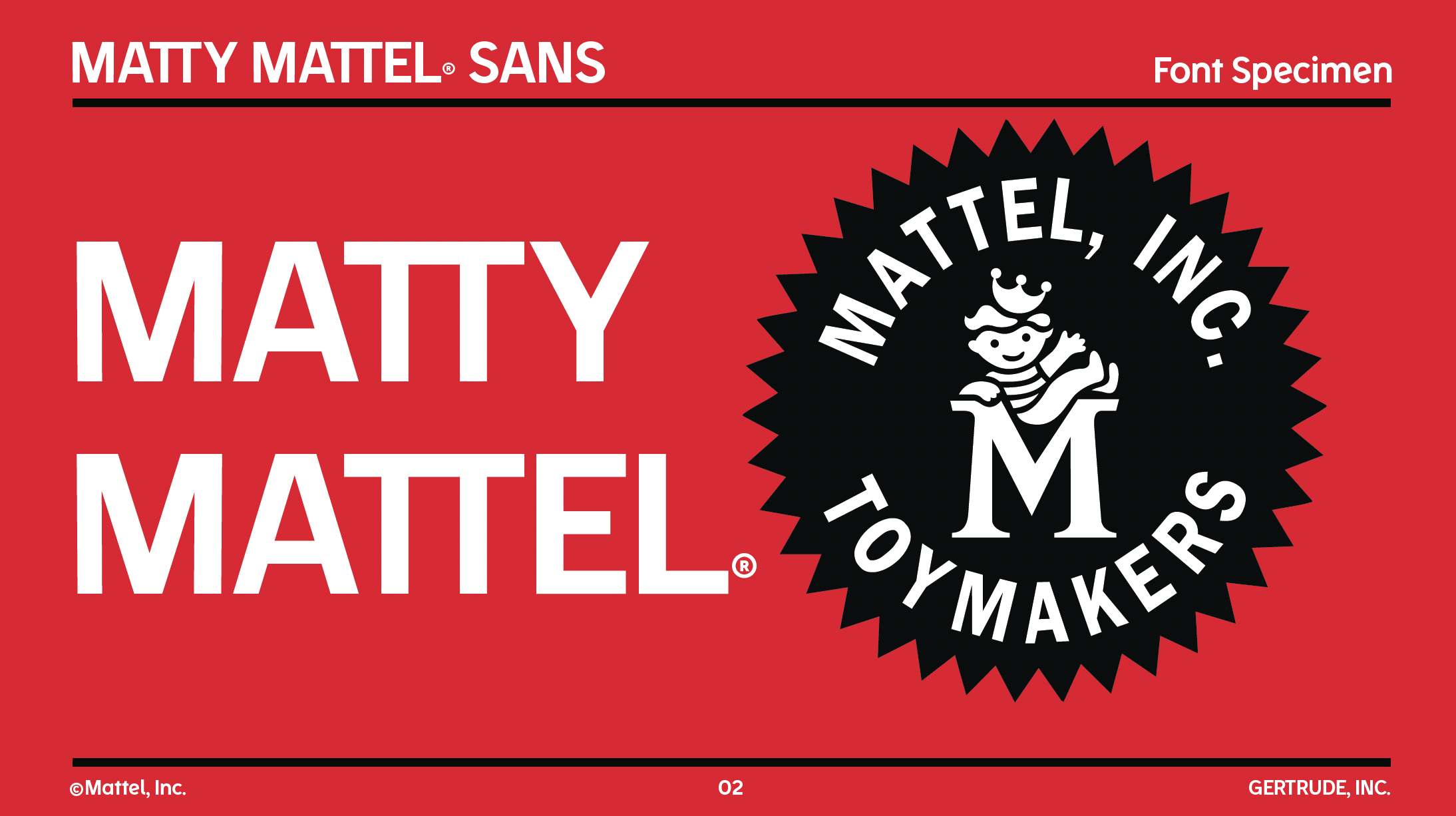
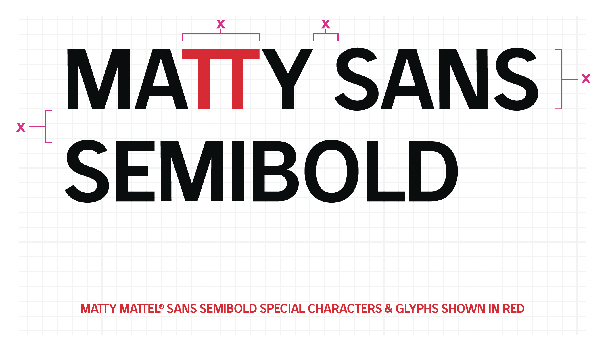
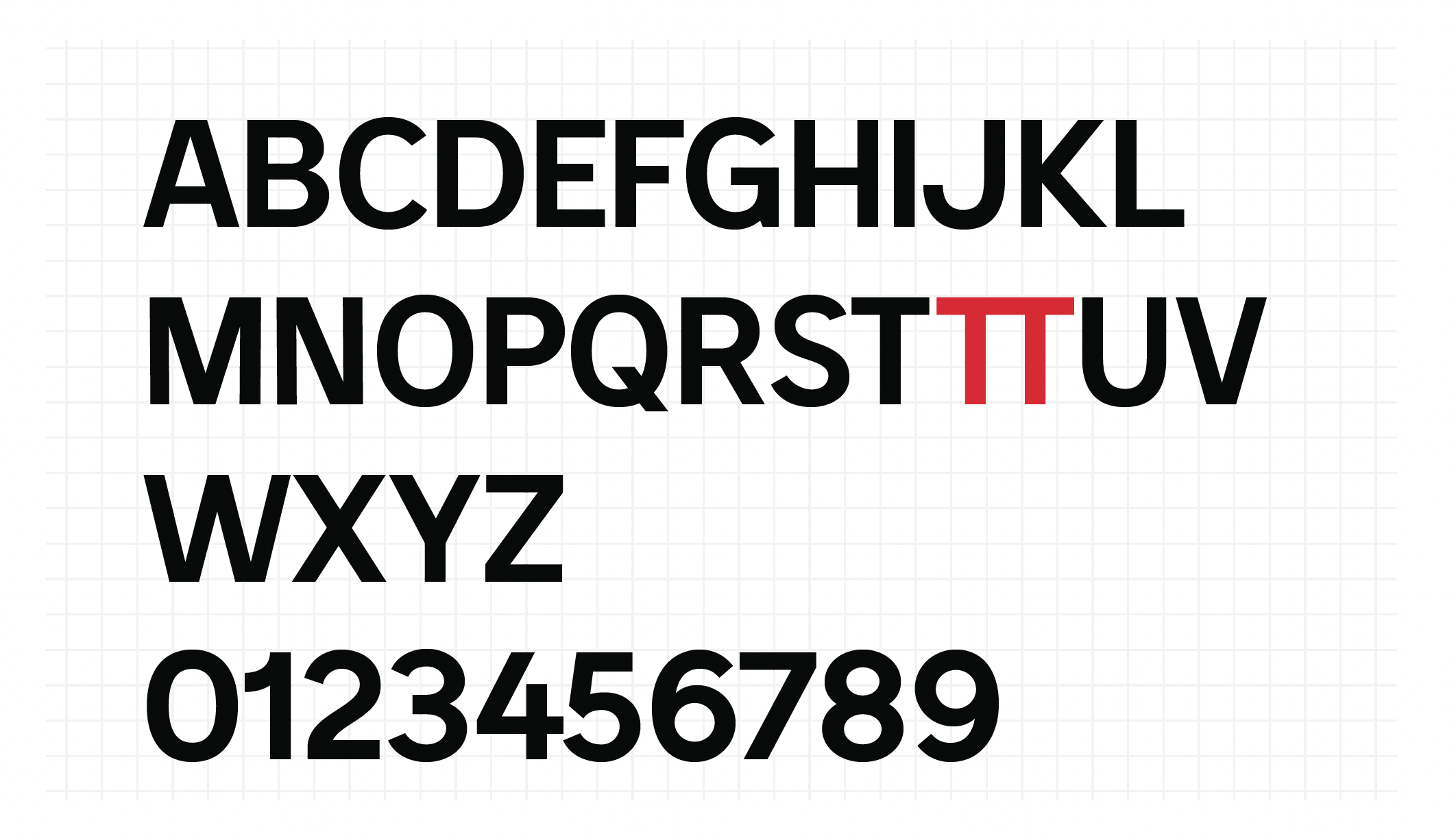
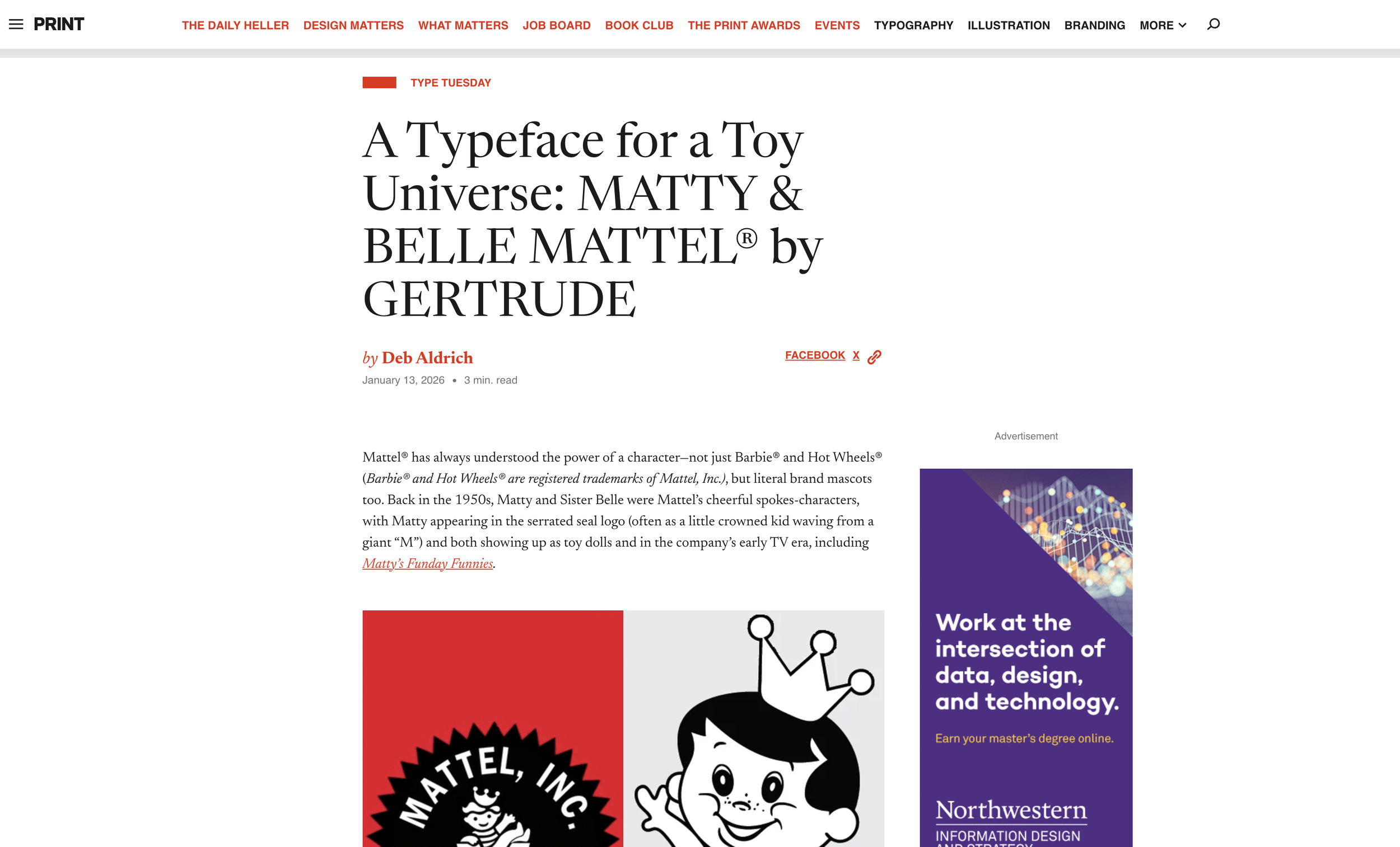
Named after "King of Toys," MATTY MATTEL®, the 1950s boy mascot for Mattel, Inc. Toymakers. MATTY is a timeless all-caps display sans serif typeface, so versatile and looks great in just about any context.
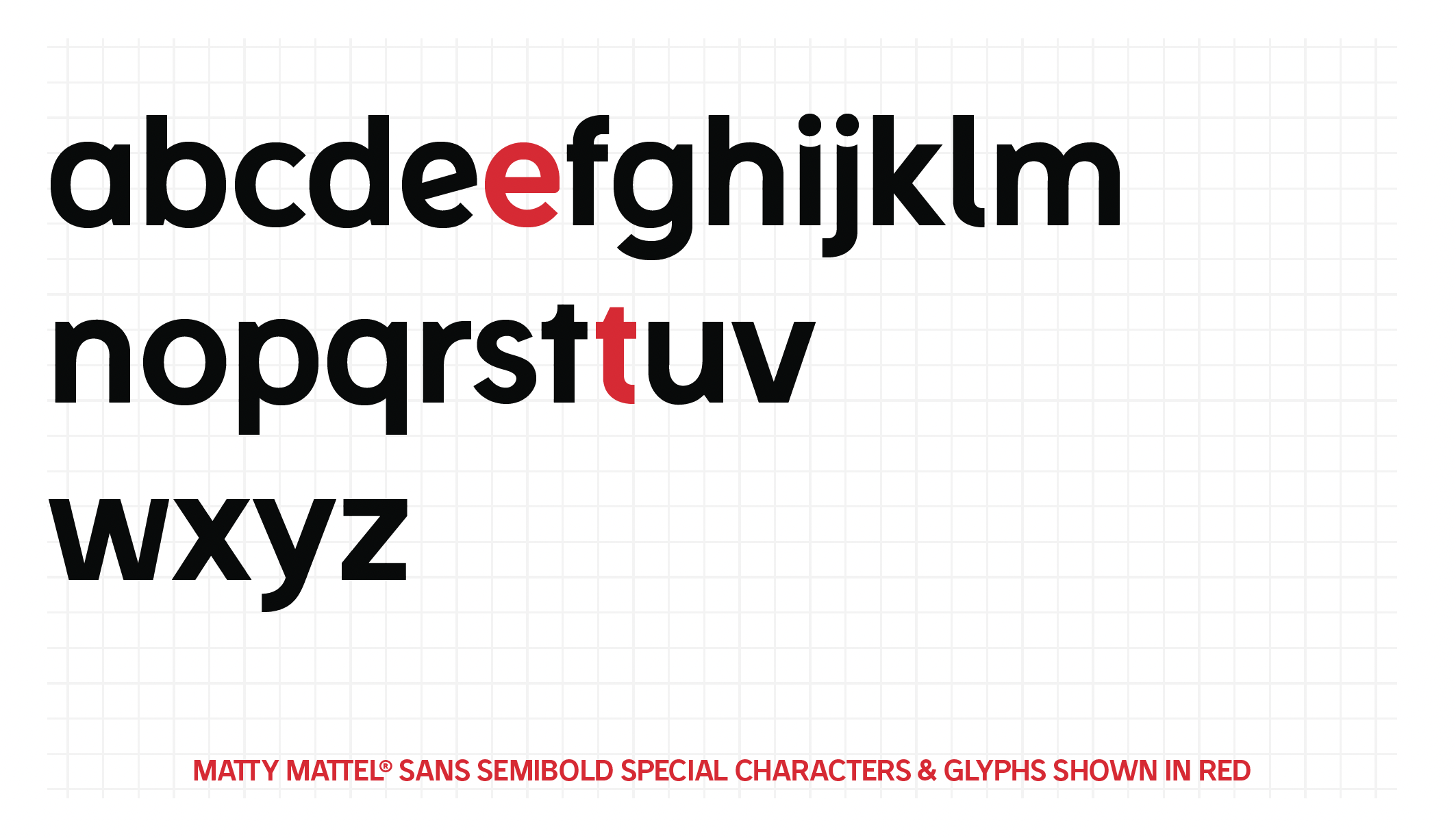
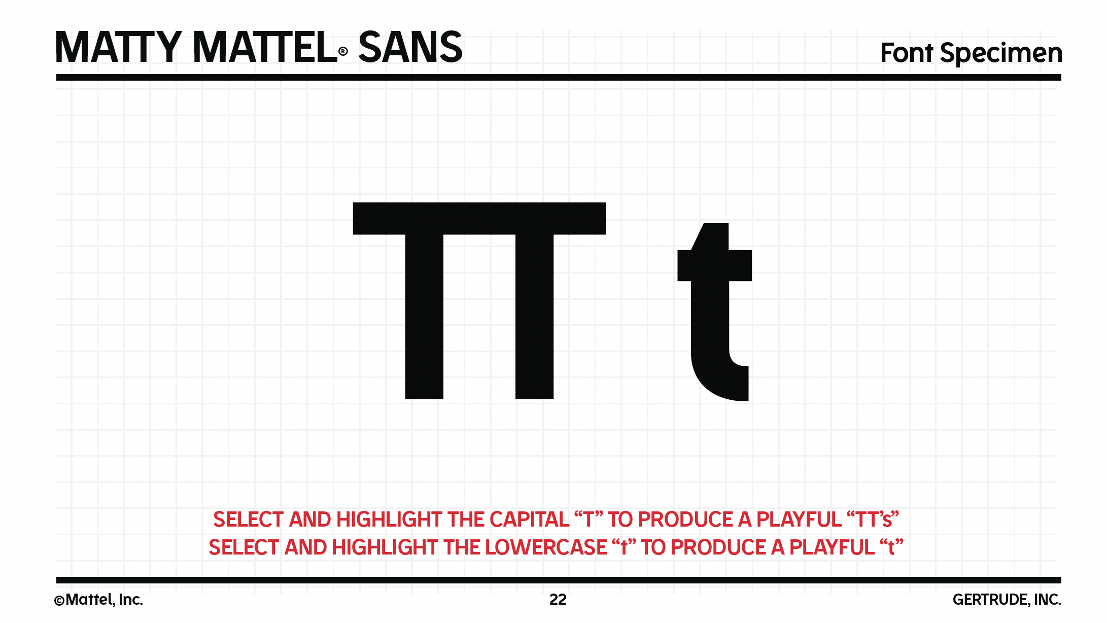
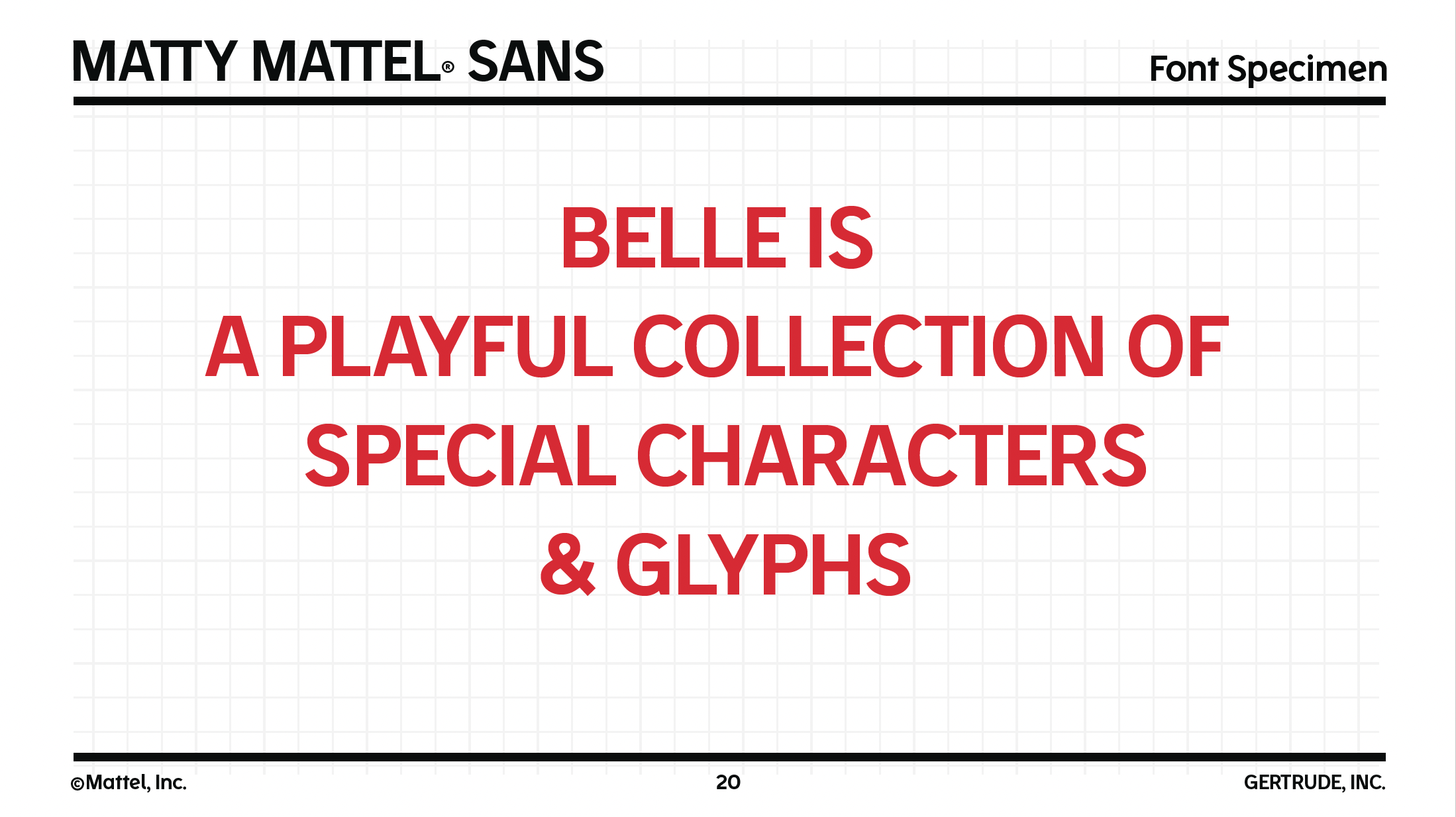
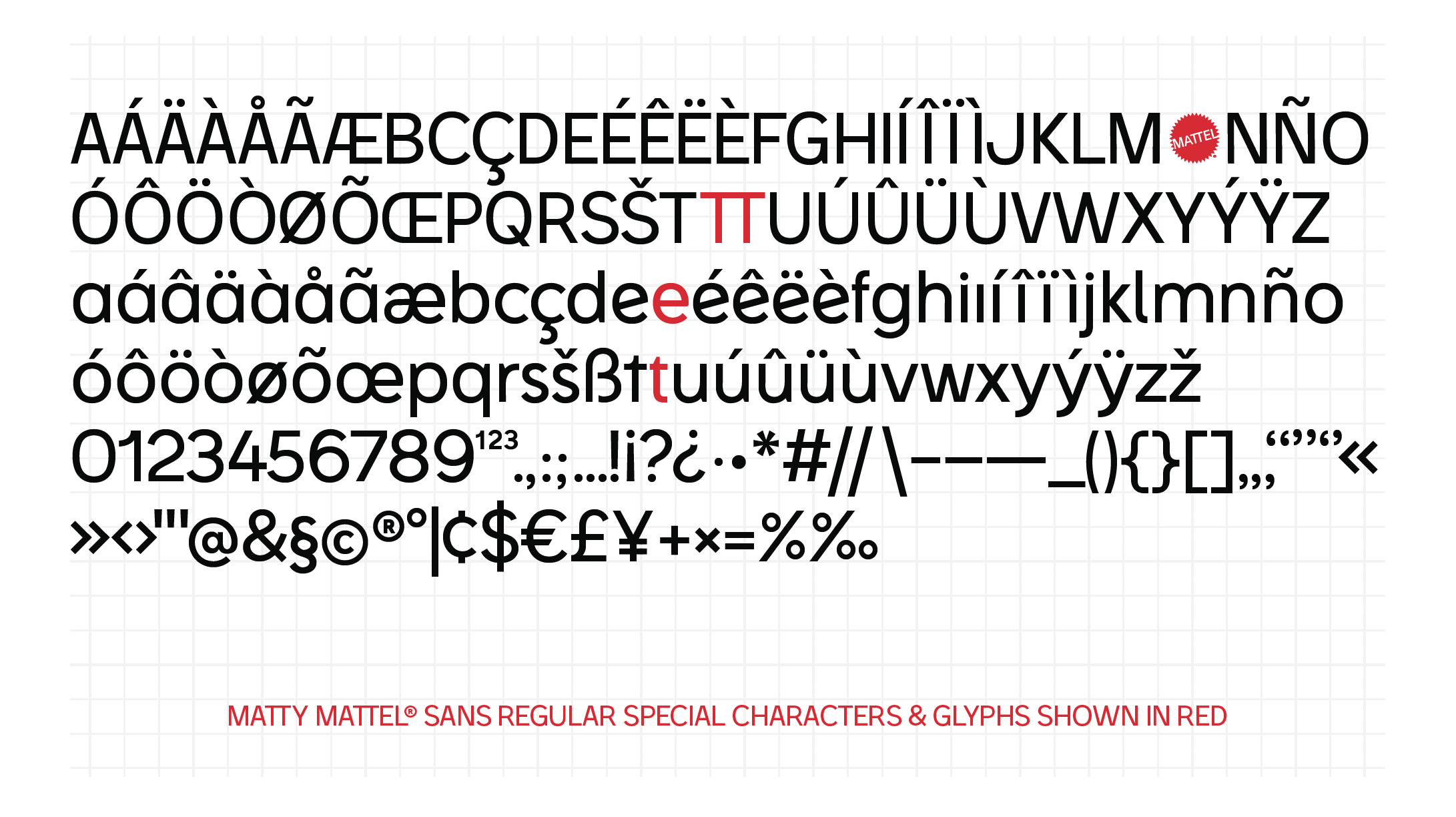
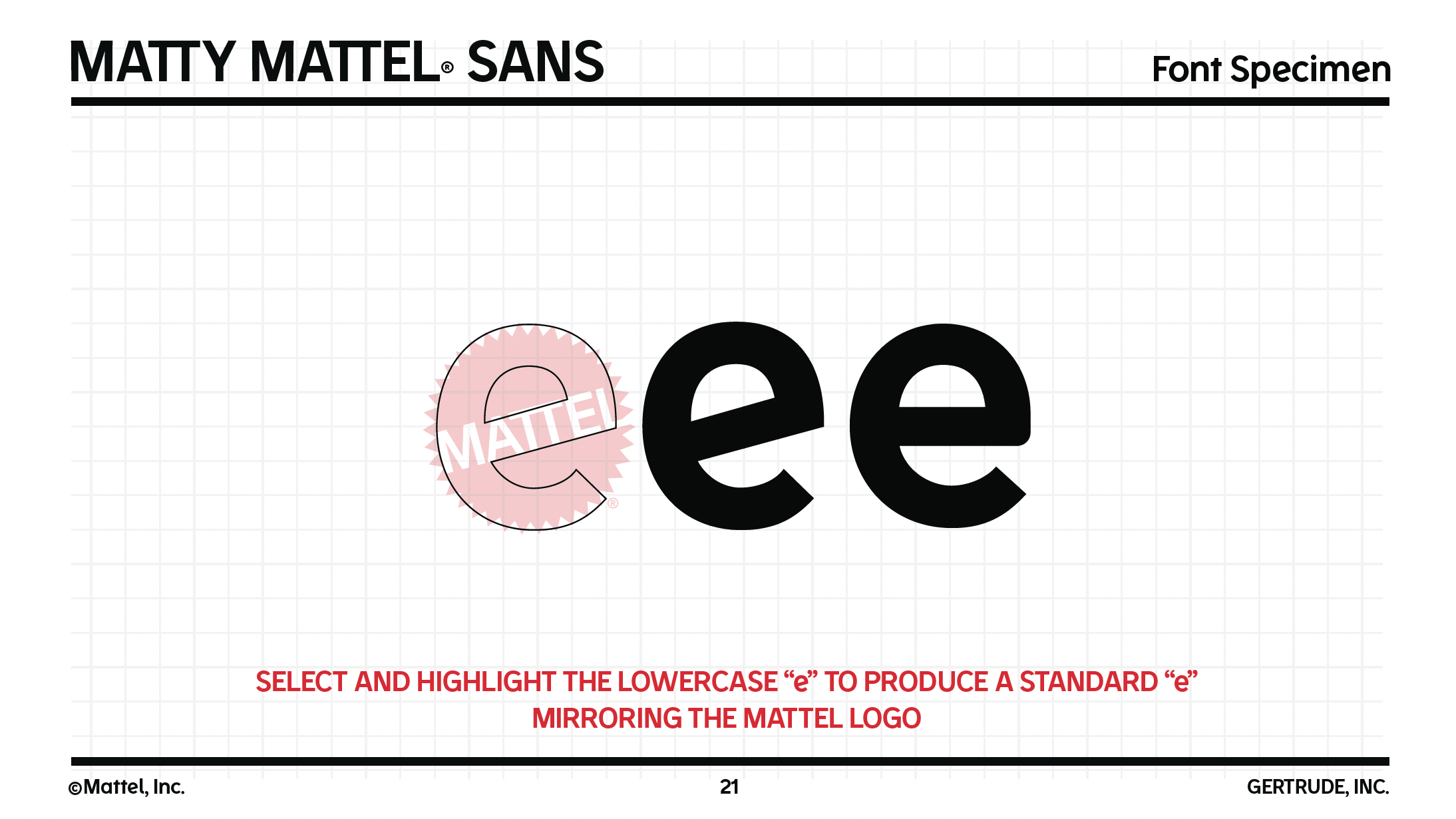
With 3 weights (Regular, Semibold, Bold) and 2 styles (MATTY & Belle MATTEL®), you can create beautiful, consistent contrast in logos, printed materials, and more. By holding down the option key, you can access the more playful characters in the Belle Special Characters & Glyphs library.
Inspired by everything MATTEL, and paired together with Poppins, MATTY, Belle, and Poppins are the exclusive original and new font trio for all things Mattel.